Analysis: an exploratory example
Jerid Francom
2019-05-06
Source:vignettes/analysis-an-exploratory-example.Rmd
analysis-an-exploratory-example.RmdExploring word frequency distributions
A common task in text analysis is to explore the distribution of words (or terms) in a text collection. There are a number of ways in which a research can operationalize frequency which can change the results quite dramatically. In this case study, I will demonstrate the difference between two frequency measures: raw counts (n) and Term-weighted Inverse Document Frequency (tf-idf). I will use the later to explore the similarity between written genres (categories) in the Brown Corpus of Written American English.
Data
Let’s access a curated version of this data through the analyzr package. First, install and load the package, and the main tidyverse tools.
library(tidyverse)
#> ── Attaching packages ───────────────────────────────────────────────────────────────────────────────────────────────────────────────────────── tidyverse 1.2.1 ──
#> ✔ ggplot2 3.1.1       ✔ purrr   0.3.2
#> ✔ tibble  2.1.1       ✔ dplyr   0.8.0.1
#> ✔ tidyr   0.8.3       ✔ stringr 1.4.0
#> ✔ readr   1.3.1       ✔ forcats 0.4.0
#> ── Conflicts ──────────────────────────────────────────────────────────────────────────────────────────────────────────────────────────── tidyverse_conflicts() ──
#> ✖ dplyr::filter() masks stats::filter()
#> ✖ dplyr::lag()    masks stats::lag()
library(tidytext)
library(analyzr)
Let’s take a look at the brown_words dataset.
glimpse(brown_words)
#> Observations: 1,004,082
#> Variables: 4
#> $ doc_id   <chr> "ca01", "ca01", "ca01", "ca01", "ca01", "ca01", "ca01",…
#> $ category <chr> "news", "news", "news", "news", "news", "news", "news",…
#> $ word     <chr> "the", "fulton", "county", "grand", "jury", "said", "fr…
#> $ tag      <chr> "at", "np-tl", "nn-tl", "jj-tl", "nn-tl", "vbd", "nr", …
To find out more about the data we can look at the data dictionary provided in the analyzr package with ?brown.
Case study
Prepare the variables
The first step will be to calculate the relevant frequency metrics. Each of our measures will be grouped by category to highlight the similarity and difference between each.
brown_category_words <- # word counts by category
  brown_words %>%
  group_by(category, word) %>%
  count(sort = TRUE) %>%
  ungroup()

brown_total_words <- # calculate total words per category
  brown_category_words %>%
  group_by(category) %>%
  summarise(total = sum(n))

# Add `total` to `brown_category_words`
brown_category_words <- left_join(brown_category_words, brown_total_words)
#> Joining, by = "category"

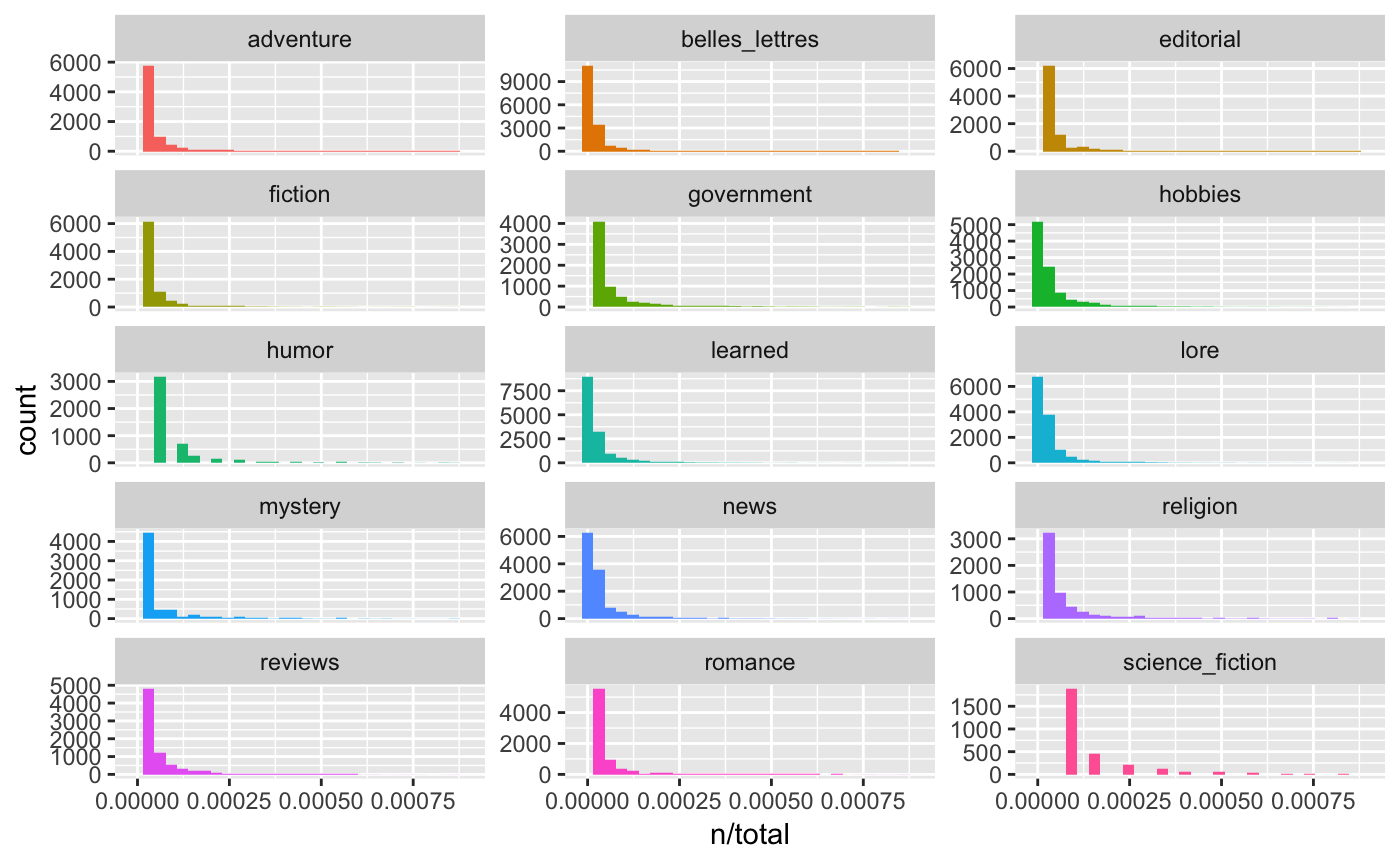
# Observe the natural skew of word frequency distributions
brown_category_words %>%
  ggplot(aes(n/total, fill = category)) +
  geom_histogram(show.legend = FALSE) +
  xlim(NA, .0009) +
  facet_wrap(~category, ncol = 3, scales = "free_y")
#> `stat_bin()` using `bins = 30`. Pick better value with `binwidth`.
#> Warning: Removed 1749 rows containing non-finite values (stat_bin).
#> Warning: Removed 15 rows containing missing values (geom_bar).
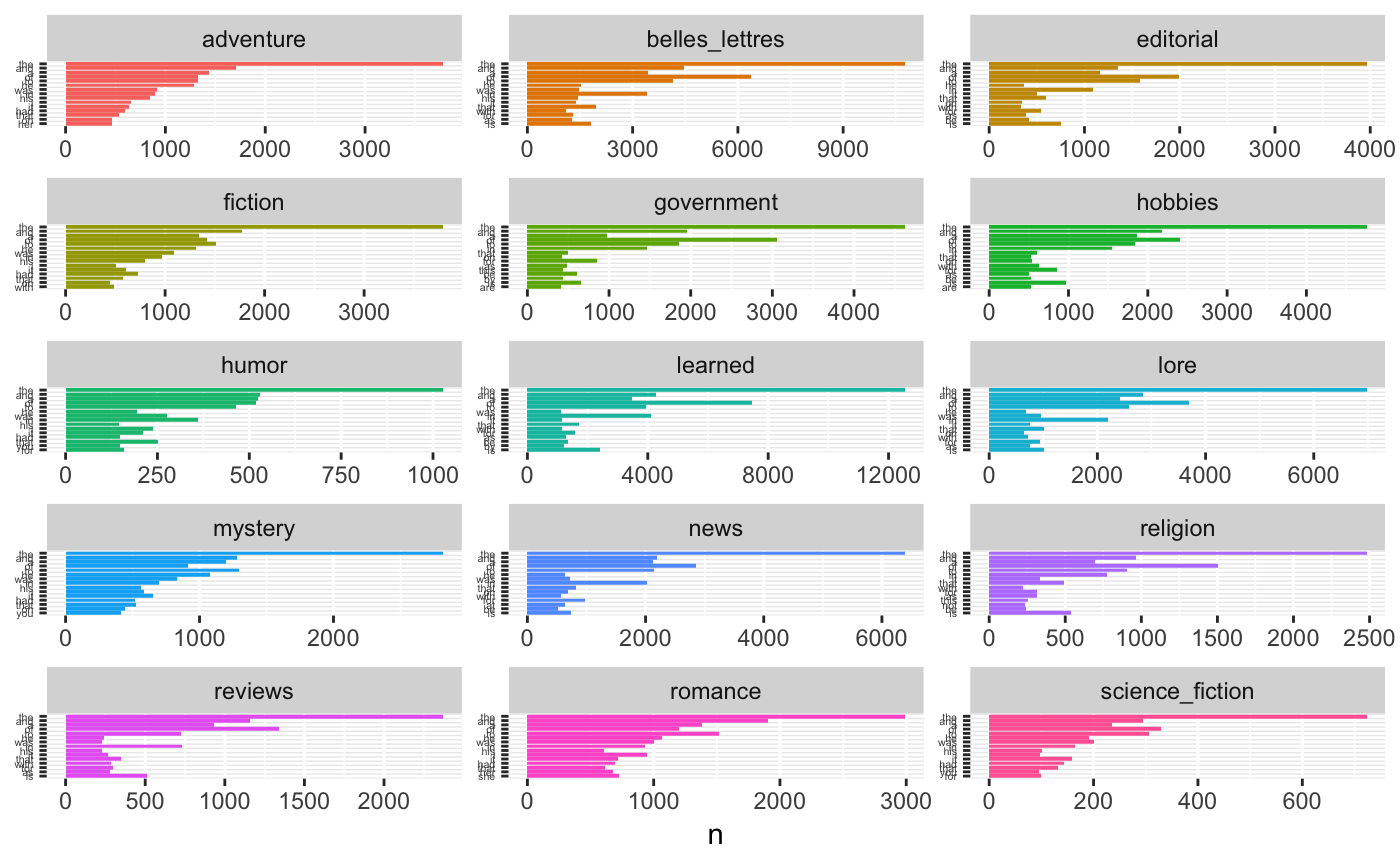
# Observe the top 15 most frequent words in each category
brown_category_words %>%
  arrange(category, desc(n)) %>%
  mutate(word = factor(word, levels = rev(unique(word)))) %>%
  group_by(category) %>%
  top_n(15, n) %>%
  ungroup() %>%
  ggplot(aes(word, n, fill = category)) +
  geom_col(show.legend = FALSE) +
  labs(x = NULL, y = "n") +
  theme(axis.text.y = element_text(size = 4)) +
  facet_wrap(~category, ncol = 3, scales = "free") +
  coord_flip()
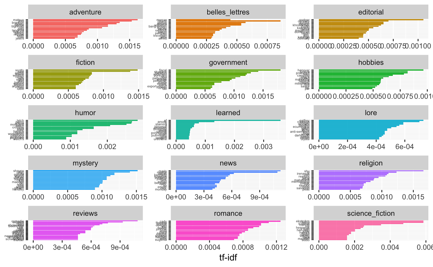
As we can see the most frequent words, in terms of number of occurrences is very similar between the categories. This is very much expected as natural language tends to show a striking leftward skew in frequency counts with primarily grammatical words forming the majority of word tokens in any (sizable) corpus. To distinguish between the words the form the scaffolding of language (grammatical) and words of importance (content), we will use the Term-weighted Inverse Document Frequency (tf-idf). This measure takes into the account the overall distribution across documents within a category weighting those terms that occur in many documents within a category (such as those in the above raw frequency plot) lower. On the whole, this measure attempts to strikes a balance between common grammatical terms and content terms.
brown_category_freq <- # calculate the tf-idf measure
  brown_category_words %>%
  bind_tf_idf(word, category, n) %>%
  arrange(category, desc(tf_idf)) %>%
  ungroup()

brown_category_freq # View
#> # A tibble: 135,497 x 7
#>    category  word         n total       tf   idf   tf_idf
#>    <chr>     <chr>    <int> <int>    <dbl> <dbl>    <dbl>
#>  1 adventure matsuo      35 58347 0.000600  2.71 0.00162
#>  2 adventure jess        33 58347 0.000566  2.71 0.00153
#>  3 adventure brannon     29 58347 0.000497  2.71 0.00135
#>  4 adventure ramey       28 58347 0.000480  2.71 0.00130
#>  5 adventure barton      25 58347 0.000428  2.71 0.00116
#>  6 adventure tilghman    25 58347 0.000428  2.71 0.00116
#>  7 adventure curt        31 58347 0.000531  2.01 0.00107
#>  8 adventure greg        25 58347 0.000428  2.01 0.000863
#>  9 adventure langford    18 58347 0.000308  2.71 0.000835
#> 10 adventure lalaurie    17 58347 0.000291  2.71 0.000789
#> # … with 135,487 more rows

# Plot the 15 most important terms (tf-idf) for each category
brown_category_freq %>%
  arrange(desc(tf_idf)) %>%
  mutate(word = factor(word, levels = rev(unique(word)))) %>%
  group_by(category) %>%
  top_n(15, tf_idf) %>%
  ungroup() %>%
  ggplot(aes(word, tf_idf, fill = category)) +
  geom_col(show.legend = FALSE) +
  labs(x = NULL, y = "tf-idf") +
  theme(axis.text.y = element_text(size = 4)) +
  facet_wrap(~category, ncol = 3, scales = "free") +
  coord_flip()
Analysis
Category similarity
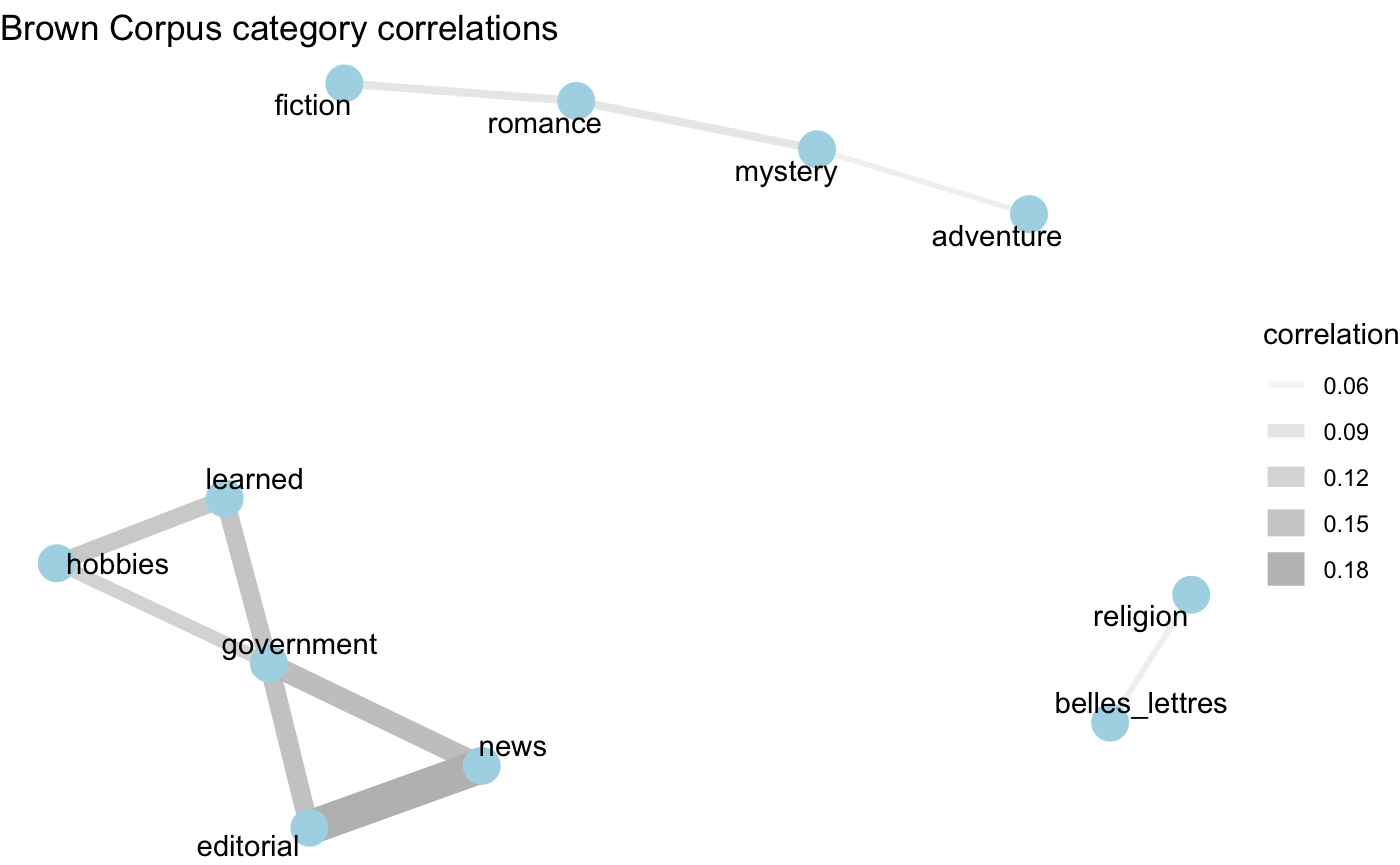
Now that we have a measure which helps us get at the content of the categories, let’s now find out which categories tend to be similar to each other in text content. We will want to find the pairwise corrlation between the word frequencies and categories. The widyr package provides a key function for this task pairwise_cor(). We will use the tf_idf score to focus in on the distribution of words from a importance-based perspective.
library(widyr)

brown_category_cor <-
  brown_category_freq %>%
  pairwise_cor(category, word, tf_idf)

brown_category_cor # View the cateogory-category correlation coefficients
#> # A tibble: 210 x 3
#>    item1          item2     correlation
#>    <chr>          <chr>           <dbl>
#>  1 belles_lettres adventure    -0.0225
#>  2 editorial      adventure    -0.0236
#>  3 fiction        adventure     0.0431
#>  4 government     adventure    -0.0249
#>  5 hobbies        adventure    -0.0124
#>  6 humor          adventure    -0.00166
#>  7 learned        adventure    -0.0330
#>  8 lore           adventure    -0.00805
#>  9 mystery        adventure     0.0538
#> 10 news           adventure    -0.0169
#> # … with 200 more rows
To appreciate the relationships between the categories, we will plot a network graph. This requires packages for visualizing networks ggraph and igraph.
library(ggraph)
library(igraph)
#>
#> Attaching package: 'igraph'
#> The following objects are masked from 'package:dplyr':
#>
#>     as_data_frame, groups, union
#> The following objects are masked from 'package:purrr':
#>
#>     compose, simplify
#> The following object is masked from 'package:tidyr':
#>
#>     crossing
#> The following object is masked from 'package:tibble':
#>
#>     as_data_frame
#> The following objects are masked from 'package:stats':
#>
#>     decompose, spectrum
#> The following object is masked from 'package:base':
#>
#>     union

set.seed(1234) # make the network graph reproducible

brown_category_cor %>%
  filter(correlation > .05) %>% # set a minimal threshold on correlation
  graph_from_data_frame() %>%
  ggraph(layout = "fr") +
  geom_edge_link(aes(alpha = correlation, width = correlation), color = "grey") +
  geom_node_point(size = 6, color = "lightblue") +
  geom_node_text(aes(label = name), repel = TRUE) +
  labs(title = "Brown Corpus category correlations") +
  theme_void()