Data: The Tidy and the Untidy
Jerid Francom
2019-05-06
Source:vignettes/data-the-tidy-and-the-untidy.Rmd
data-the-tidy-and-the-untidy.RmdGoals
In this vignette I will introduce the notion of ‘tidy’ data. I will provide an example dataset for both tidy format and ‘untidy’ format. The goal is to help you understand what it means for a dataset to be tidy, why this is a conducive format for data analysis, and some basic operations to convert untidy datasets into tidy datasets.
Setup
Let’s attach the packages we will need for this vignette. If you do not have a package, use the RStudio interface, or the following command, to install it before continuing.
library(tidyverse) # core packages
#> ── Attaching packages ───────────────────────────────────────────────────────────────────────────────────────────────────────────────────────── tidyverse 1.2.1 ──
#> ✔ ggplot2 3.1.1       ✔ purrr   0.3.2
#> ✔ tibble  2.1.1       ✔ dplyr   0.8.0.1
#> ✔ tidyr   0.8.3       ✔ stringr 1.4.0
#> ✔ readr   1.3.1       ✔ forcats 0.4.0
#> ── Conflicts ──────────────────────────────────────────────────────────────────────────────────────────────────────────────────────────── tidyverse_conflicts() ──
#> ✖ dplyr::filter() masks stats::filter()
#> ✖ dplyr::lag()    masks stats::lag()
library(rio) # import/export
library(datasets) # a package of toy datasets
Tidy approach to data
The data frame is the fundamental data structure for organizing data for analysis in R. A data frame in essence is just a collection of vectors of the same length. Each of these vectors will be of a single type (i.e. character, factor, integer, logical, etc.) corresponding to the type of information contained in each vector.
But when we conduct research the relationships between the vectors in the data.frame matter. Each row should correspond to an observation and each column an attribute of each observation. This is what is known as a ‘tidy’ dataset.
Tidy data
Let’s make use of some data that is made available by default in R. Specifically we’ll take a look at the msleep dataset, a dataset containing the sleep times and weights of various mammals. Let’s get a sense of what that data look like with glimpse().
glimpse(msleep) # view the data
#> Observations: 83
#> Variables: 11
#> $ name         <chr> "Cheetah", "Owl monkey", "Mountain beaver", "Greate…
#> $ genus        <chr> "Acinonyx", "Aotus", "Aplodontia", "Blarina", "Bos"…
#> $ vore         <chr> "carni", "omni", "herbi", "omni", "herbi", "herbi",…
#> $ order        <chr> "Carnivora", "Primates", "Rodentia", "Soricomorpha"…
#> $ conservation <chr> "lc", NA, "nt", "lc", "domesticated", NA, "vu", NA,…
#> $ sleep_total  <dbl> 12.1, 17.0, 14.4, 14.9, 4.0, 14.4, 8.7, 7.0, 10.1, …
#> $ sleep_rem    <dbl> NA, 1.8, 2.4, 2.3, 0.7, 2.2, 1.4, NA, 2.9, NA, 0.6,…
#> $ sleep_cycle  <dbl> NA, NA, NA, 0.1333333, 0.6666667, 0.7666667, 0.3833…
#> $ awake        <dbl> 11.9, 7.0, 9.6, 9.1, 20.0, 9.6, 15.3, 17.0, 13.9, 2…
#> $ brainwt      <dbl> NA, 0.01550, NA, 0.00029, 0.42300, NA, NA, NA, 0.07…
#> $ bodywt       <dbl> 50.000, 0.480, 1.350, 0.019, 600.000, 3.850, 20.490…
We see that there are 83 observations and 11 variables. Each variable corresponds to an attribute of the specific animal. We see that there are 5 categorical variables and 6 continuous variables. It is also apparent that there is some missing data, which is represented with NA or <NA> values depending on the variable type (categorical or continuous). It is not uncommon to have missing values in various cells of a dataset, for now it is just worth noting how they are represented in the data.
We can also see the data in a more standard tabular format by typing the name of the dataset in the Console.
msleep # tabular view of the data
#> # A tibble: 83 x 11
#>    name  genus vore  order conservation sleep_total sleep_rem sleep_cycle
#>    <chr> <chr> <chr> <chr> <chr>              <dbl>     <dbl>       <dbl>
#>  1 Chee… Acin… carni Carn… lc                  12.1      NA        NA
#>  2 Owl … Aotus omni  Prim… <NA>                17         1.8      NA
#>  3 Moun… Aplo… herbi Rode… nt                  14.4       2.4      NA
#>  4 Grea… Blar… omni  Sori… lc                  14.9       2.3       0.133
#>  5 Cow   Bos   herbi Arti… domesticated         4         0.7       0.667
#>  6 Thre… Brad… herbi Pilo… <NA>                14.4       2.2       0.767
#>  7 Nort… Call… carni Carn… vu                   8.7       1.4       0.383
#>  8 Vesp… Calo… <NA>  Rode… <NA>                 7        NA        NA
#>  9 Dog   Canis carni Carn… domesticated        10.1       2.9       0.333
#> 10 Roe … Capr… herbi Arti… lc                   3        NA        NA
#> # … with 73 more rows, and 3 more variables: awake <dbl>, brainwt <dbl>,
#> #   bodywt <dbl>
Some of the variable names may not be altogether transparent, so let’s take a look at the data dictionary with ?msleep. After running this command in the Console you will get a help page with a description of the dataset.
Since each row is an observation and each column an attribute of the data we have a tidy dataset. And at this point we could start an exploration of the data by creating table or plot summaries of the data. For example, we might be interested in finding out the how many types of vore there are and how many of each type there are.
msleep %>%
  count(vore, sort = TRUE) %>% # count `vore` and sort ascending
  head() # only show the top 5 rows
#> # A tibble: 5 x 2
#>   vore        n
#>   <chr>   <int>
#> 1 herbi      32
#> 2 omni       20
#> 3 carni      19
#> 4 <NA>        7
#> 5 insecti     5
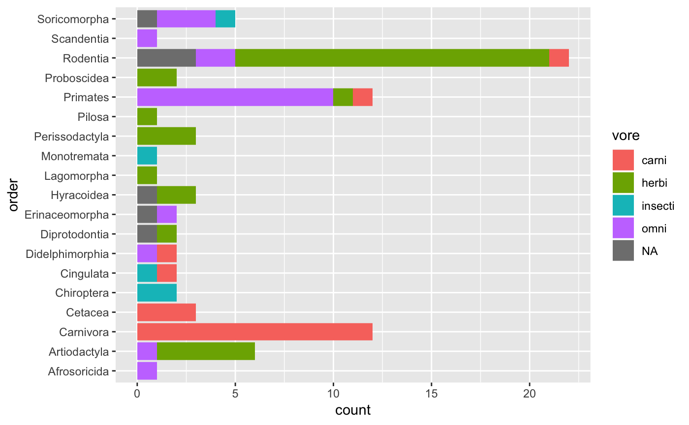
Herbivores are the most common and insectivores the least common. We can also do a cross-tabulation of vore and order.
msleep %>%
  count(vore, order, sort = TRUE) %>% # count `vore` by `order` and sort
  head() # top 5 rows
#> # A tibble: 6 x 3
#>   vore  order            n
#>   <chr> <chr>        <int>
#> 1 herbi Rodentia        16
#> 2 carni Carnivora       12
#> 3 omni  Primates        10
#> 4 herbi Artiodactyla     5
#> 5 <NA>  Rodentia         3
#> 6 carni Cetacea          3
This table summary might start to get a little unwieldy, so a graphical approach may be in order.
msleep %>%
  ggplot(aes(x = order, fill = vore)) + # map `order` to x, and `vore` as fill for the bars
  geom_bar() + # visualize as a bar plot
  coord_flip() # flip the x/y axes to better display `order` names
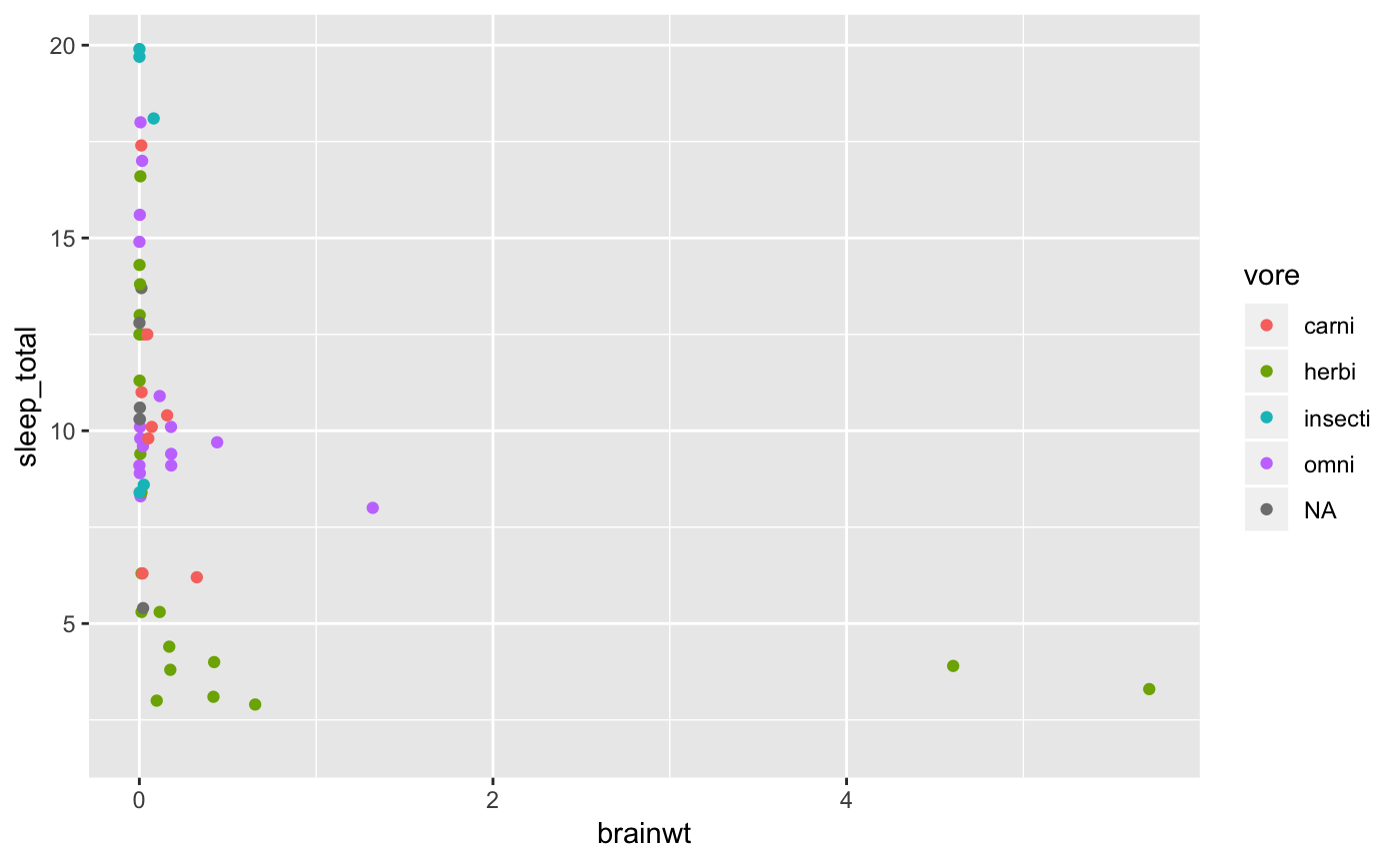
When working with relationships where we are working with one or more continuous variables, scatterplots are a good first choice for visualizing the data. Let’s take a look at the relationship between sleep_total and bodywt and add the vore status as another attribute.
msleep %>%
  ggplot(aes(x = brainwt, y = sleep_total, color = vore)) + # map x and y and add a color layer to the plot for `vore`
  geom_point() # visualize as a scatterplot
#> Warning: Removed 27 rows containing missing values (geom_point).
Untidy data
Now let’s read some data from the Pew Research Center on religion and income.
Now let’s take a look at the data.
glimpse(pew)
#> Observations: 18
#> Variables: 11
#> $ religion             <chr> "Agnostic", "Atheist", "Buddhist", "Catholi…
#> $ `<$10k`              <int> 27, 12, 27, 418, 15, 575, 1, 228, 20, 19, 2…
#> $ `$10-20k`            <int> 34, 27, 21, 617, 14, 869, 9, 244, 27, 19, 4…
#> $ `$20-30k`            <int> 60, 37, 30, 732, 15, 1064, 7, 236, 24, 25, …
#> $ `$30-40k`            <int> 81, 52, 34, 670, 11, 982, 9, 238, 24, 25, 6…
#> $ `$40-50k`            <int> 76, 35, 33, 638, 10, 881, 11, 197, 21, 30, …
#> $ `$50-75k`            <int> 137, 70, 58, 1116, 35, 1486, 34, 223, 30, 9…
#> $ `$75-100k`           <int> 122, 73, 62, 949, 21, 949, 47, 131, 15, 69,…
#> $ `$100-150k`          <int> 109, 59, 39, 792, 17, 723, 48, 81, 11, 87, …
#> $ `>150k`              <int> 84, 74, 53, 633, 18, 414, 54, 78, 6, 151, 6…
#> $ `Don't know/refused` <int> 96, 76, 54, 1489, 116, 1529, 37, 339, 37, 1…
The dataset contains 18 observations and 11 variables. Let’s preview the tabular output.
pew
#> # A tibble: 18 x 11
#>    religion `<$10k` `$10-20k` `$20-30k` `$30-40k` `$40-50k` `$50-75k`
#>    <chr>      <int>     <int>     <int>     <int>     <int>     <int>
#>  1 Agnostic      27        34        60        81        76       137
#>  2 Atheist       12        27        37        52        35        70
#>  3 Buddhist      27        21        30        34        33        58
#>  4 Catholic     418       617       732       670       638      1116
#>  5 Don’t k…      15        14        15        11        10        35
#>  6 Evangel…     575       869      1064       982       881      1486
#>  7 Hindu          1         9         7         9        11        34
#>  8 Histori…     228       244       236       238       197       223
#>  9 Jehovah…      20        27        24        24        21        30
#> 10 Jewish        19        19        25        25        30        95
#> 11 Mainlin…     289       495       619       655       651      1107
#> 12 Mormon        29        40        48        51        56       112
#> 13 Muslim         6         7         9        10         9        23
#> 14 Orthodox      13        17        23        32        32        47
#> 15 Other C…       9         7        11        13        13        14
#> 16 Other F…      20        33        40        46        49        63
#> 17 Other W…       5         2         3         4         2         7
#> 18 Unaffil…     217       299       374       365       341       528
#> # … with 4 more variables: `$75-100k` <int>, `$100-150k` <int>,
#> #   `>150k` <int>, `Don't know/refused` <int>
Considering our ‘tidy’ dataset definition, what is wrong with the following data frame?
How should this data ideally be structured for tidy-style analysis?
Tidying data
The basic problem here is that our data is a summary of religion and various levels of income. So in essence, we really only have two variables, religion and income. The gather() function will allow us to effectively group the income levels into one column (income). We exclude the religion column.
pew_tidy_sum <-
  pew %>%
  gather(income, count, -religion)
pew_tidy_sum
#> # A tibble: 180 x 3
#>    religion                income count
#>    <chr>                   <chr>  <int>
#>  1 Agnostic                <$10k     27
#>  2 Atheist                 <$10k     12
#>  3 Buddhist                <$10k     27
#>  4 Catholic                <$10k    418
#>  5 Don’t know/refused      <$10k     15
#>  6 Evangelical Prot        <$10k    575
#>  7 Hindu                   <$10k      1
#>  8 Historically Black Prot <$10k    228
#>  9 Jehovah's Witness       <$10k     20
#> 10 Jewish                  <$10k     19
#> # … with 170 more rows
The real number of observations is still not transparent as we still have counts for each of the combinations of religion and income. To find out how many observations where made we can sum the counts. We can see how many true observation there are by summing the count column.
We can unsummarize this data into individual observations with uncount().
pew_tidy_ind <- uncount(pew_tidy_sum, count)
pew_tidy_ind
#> # A tibble: 35,556 x 2
#>    religion income
#>    <chr>    <chr>
#>  1 Agnostic <$10k
#>  2 Agnostic <$10k
#>  3 Agnostic <$10k
#>  4 Agnostic <$10k
#>  5 Agnostic <$10k
#>  6 Agnostic <$10k
#>  7 Agnostic <$10k
#>  8 Agnostic <$10k
#>  9 Agnostic <$10k
#> 10 Agnostic <$10k
#> # … with 35,546 more rows
We see that the dataset now has a row for each observation, as a tidy dataset should.
We can now summarize the data in any way we see fit.
pew_tidy_ind %>%
  count(religion, sort = TRUE)
#> # A tibble: 18 x 2
#>    religion                    n
#>    <chr>                   <int>
#>  1 Evangelical Prot         9472
#>  2 Catholic                 8054
#>  3 Mainline Prot            7470
#>  4 Unaffiliated             3707
#>  5 Historically Black Prot  1995
#>  6 Agnostic                  826
#>  7 Jewish                    682
#>  8 Mormon                    581
#>  9 Atheist                   515
#> 10 Other Faiths              449
#> 11 Buddhist                  411
#> 12 Orthodox                  363
#> 13 Don’t know/refused        272
#> 14 Hindu                     257
#> 15 Jehovah's Witness         215
#> 16 Other Christian           129
#> 17 Muslim                    116
#> 18 Other World Religions      42

pew_tidy_ind %>%
  count(income, sort = TRUE)
#> # A tibble: 10 x 2
#>    income                 n
#>    <chr>              <int>
#>  1 Don't know/refused  6121
#>  2 $50-75k             5185
#>  3 $75-100k            3990
#>  4 $20-30k             3357
#>  5 $30-40k             3302
#>  6 $100-150k           3197
#>  7 $40-50k             3085
#>  8 $10-20k             2781
#>  9 >150k               2608
#> 10 <$10k               1930
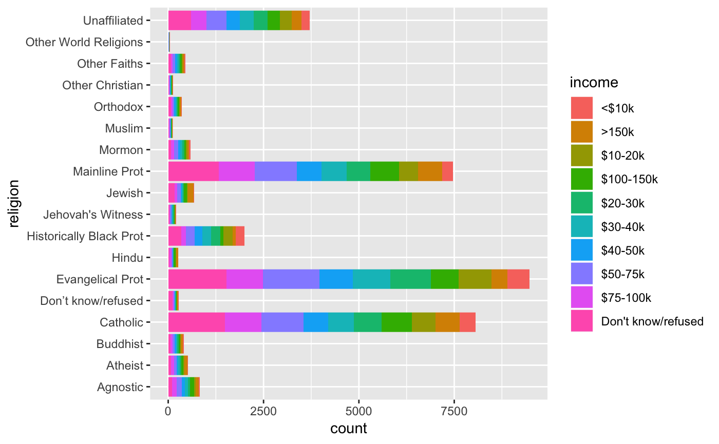
Or we can visualize the relationships with plots.
